

The next part of the passage was about the view of the land they had arrived at, I focused in on the description of the clear sky with no horizon, islands dotted around and the comparison to the West Indies. I liked the idea of the formations being slightly unnatural and unusual, as the idea of the place is that there is something unearthly about it. This made me think of Hatachi park in Japan (pictured on mood board bottom left) where their is fields and fields of this round vegetation- i't's beautifully unsettling.


I looked up photos of the west indies and created some colour swatches based on the colours I saw most often. In image 33 I sketched up a basic idea for one of the islands, with inspiration from Hatachi park on top.
The next passage of the book mentions going into the forest, with vegetation hanging from trees to trees, I incorporated this into a few of my thumbnails, I like these ones particularly as I think it really helps the composition.
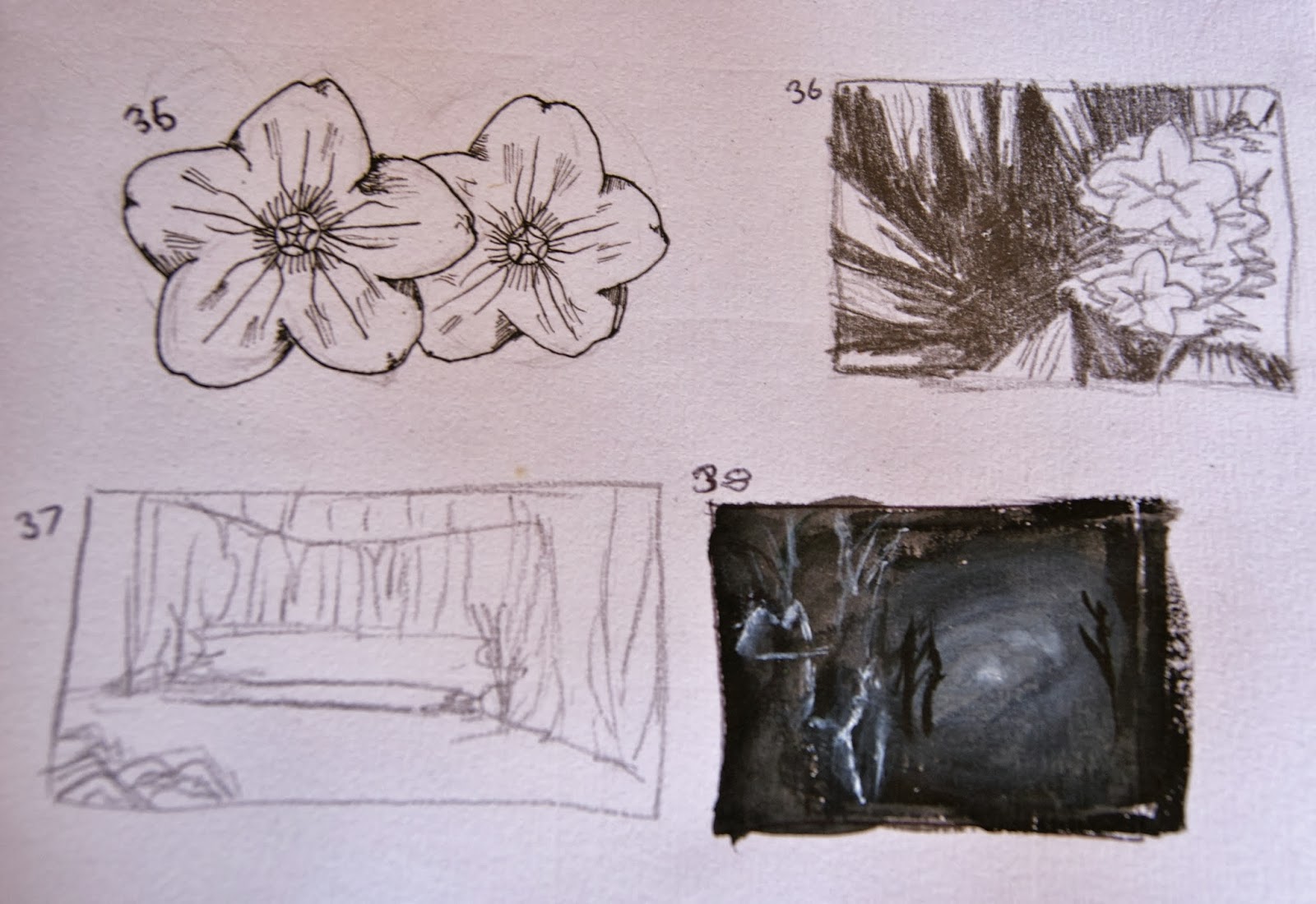
Getting deeper into the forest using images of plants from the West Indies I researched.

For the next few thumbnails I tried using photoshop to create light in different ways using different brushes. I took inspiration from a photo I took one morning with the light shining through the trees.
http://ucarochester-cgartsandanimation.blogspot.co.uk/2013/09/fao-cgaa-year-1-cinematic-spaces-online.html
ReplyDeleteGreat to see some traditional media being used. Your thumbnails are developing nicely, especially the more realised studies such as number 33. When taking these ideas into Photoshop, remember to block out form as your first step. Using a harder brush with the Opacity Jitter set will allow you to paint with more definition and things won't become overly soft or difficult to read. I'd recommend just painting a full page of thumbnails in Photoshop, quickly trying to paint the form of your image. Keep these traditional pieces going though, they are leading to a really interesting place. :)
ReplyDeleteHey, were in the creative partnership thing i think.... Your thumbnails are looking really good, my personal Favourite is no.32 because you get a really good idea of the perspective. I looked at http://www.watercolorpainting.com/perspective_1_2_3_point.htm it helped me map out my thumb nails better, it might help you?
ReplyDeleteOoh that's useful :) thanks scott!
Delete